Last Updated: October 28, 2026
Quick Summary
Turn rough ideas into professional custom designs by filling out a design brief template that captures purpose, audience, exact text, colors, size and placement, and deadline before opening any design tool. Then photograph or scan your sketch for clean tracing, prepare vector files, and run a quality check before you approve.
- Six fields carry the weight of a brief: purpose, audience, exact text, color direction, size and placement, and deadline.
- Iterate one variable at a time: subject first, style second, constraints last.
- Use two fonts maximum to keep a design from looking cluttered and busy.
- Vector art stays sharp when resized, while photo-based files may not.
- Ask someone who has not seen the design what they read first.
Table of Contents
- What You'll Need Before You Start Turning Rough Ideas into Custom Designs
- Step 1: Fill Out a Custom Design Brief Template
- Step 2: Learn How to Turn a Sketch into a Digital Design
- Step 3: Explore Custom Apparel Design Ideas and Examples
- Step 4: How to Prepare Vector Files for High Quality Apparel Printing
- Step 5: Run a Quality Check and Human Review Before You Approve
- Common Mistakes That Make a Design Look Amateur
- Request a Quote for Your Custom Design Project
- Frequently Asked Questions
What You'll Need Before You Start Turning Rough Ideas into Custom Designs
You do not need design software or an art degree to turn rough ideas into professional custom designs. You need a clear plan and a few basic tools. At Hatter and Hare Designs, our in-store design kiosk and expert associates are available to help with custom projects.
Here is what to gather before you begin:
- A rough sketch, photo, or written description of your idea
- Your exact wording, spelled correctly, for any text on the design
- A color direction, even if it is just "navy and cream"
- The finished size and where the design will appear
- Any logo files you already own
That is the whole kit.
Now, the brief.
Step 1: Fill Out a Custom Design Brief Template
A custom design brief template can capture what the design must do before anyone opens a design tool. Fill it out honestly, even if the answers feel obvious.
Copy this template and fill in the blanks:
Project name: ______ What is this for? (shirt, gift, sign, furniture accent): ______ Who is it for? ______ Exact text to include: ______ Colors I want / colors to avoid: ______ Finished size and placement: ______ Deadline: ______ Style words (bold, vintage, clean, playful): ______
The Six Fields Every Brief Needs
Six fields carry the weight: purpose, audience, exact text, color direction, size and placement, and deadline.
Write the brief in plain sentences, not fragments. "A birthday gift for my dad, who loves fly fishing, in muted greens" tells a designer more than "fishing theme."
A Worked Example: From Rough Note to Usable Brief
Here is how a messy idea becomes a brief a designer can act on. Start with the note you would actually text a friend:
"want a shirt for our lake trip, something with a fish but not cheesy, maybe blue"
Now fill the six fields:
- Purpose: one shirt for a family lake trip, worn in photos
- Audience: adults ages 30-60, mixed sizes, mostly wearing navy or gray
- Exact text: "Lake Days" on the front, "2026" small on the sleeve
- Colors: lake blue and cream; avoid neon and pure black
- Size and placement: left chest, about 3.5 inches wide; sleeve text about 1 inch
- Deadline: two weeks before the trip
- Style words: clean, slightly vintage, not cartoonish
The second version answers the questions a designer might otherwise need to ask.
Turning the Brief into Prompts and Revision Notes
For an early concept, a brief can be used as a prompt. One possible pattern is to lead with subject, then style, then constraints:
"Simple line-art fish inside a circle, vintage lake style, two colors, lake blue and cream, no text, centered composition, flat vector look"
Then iterate one variable at a time so you can tell what changed:
- Subject first. Get the object or figure right before touching style.
- Style second. Add words like "vintage," "minimal," or "hand-drawn" only after the subject reads clearly.
- Constraints last. Add color count, background, and text placement once the shape works.
When writing revision notes, be specific and comparative: "Make the fish 20% smaller and move it up so the text has room below" is more specific than "make it better."
Treat the brief as a living document. Update it when the size, text, or deadline changes.
Step 2: Learn How to Turn a Sketch into a Digital Design
Turning a sketch into a digital design can involve capturing a drawing and tracing or rebuilding it in a design program. A blurry photo can produce a blurry tracing.
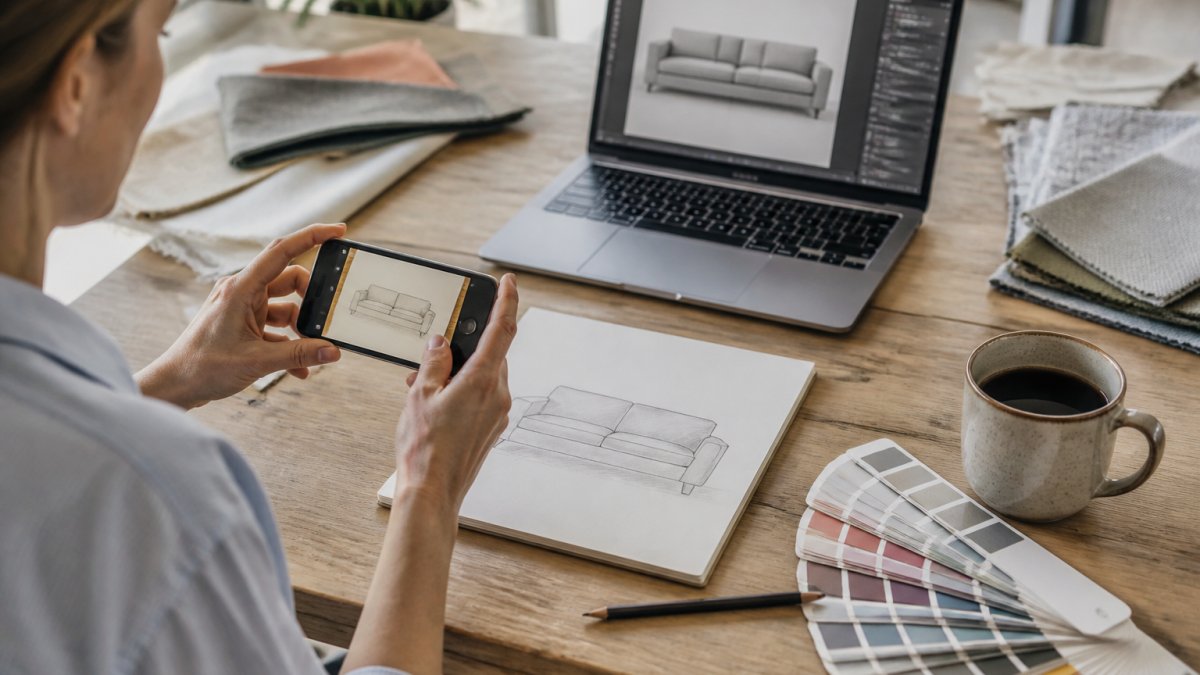
Photographing and Scanning Your Sketch for Cleaner Tracing
For simple shapes, many people now use generative AI to draft a starting image, then refine it by hand. That can save time on early concepts, though Adobe's 2026 Creative Trends forecast notes these tools produce quick polished results without guaranteeing production-ready files. Treat AI output as a sketch, not a finish line.
Step 3: Explore Custom Apparel Design Ideas and Examples
Custom apparel design ideas can start from the garment or the artwork. Look at examples before you commit.
Step 4: How to Prepare Vector Files for High Quality Apparel Printing
Preparing vector files for high quality apparel printing can involve converting artwork into scalable shapes, saving it in a suitable format, and setting a color mode. Vector art can stay sharp when resized; photo-based files may not (Raster vs. vector: What are the differences?).
Choosing Print-Ready File Formats and Color Modes
Match the file to the job:
| File Type | Best For | Watch Out For |
|---|---|---|
| Vector (SVG, EPS, AI) | Logos, text, simple shapes | Must be true vector, not a renamed image |
| Sharing with a printer | Confirm fonts are outlined | |
| PNG | Photos with transparency | Loses sharpness when enlarged |
| JPG | Photos, no transparency | No transparent background |
Set your color mode to the one your printer requests, and keep your palette limited. Penji's guide to production-ready design stresses matching exact brand colors and using the right file format before handoff. Get this step right and reprints become rare.
Step 5: Run a Quality Check and Human Review Before You Approve
A quality check can be a list to run before approving a design. Human review can catch issues such as wrong names, odd spacing, or a color that clashes with a garment.
Review Criteria Beyond Spelling
A professional review looks at five things a spell-check cannot see:
- Hierarchy. Squint at the design. The most important element should still read first. If the date competes with the logo, the hierarchy is wrong.
- Readability at final size. View the design at the size it will print, not zoomed in on a monitor. Small type that looks fine on screen can turn to mush on fabric.
- Contrast. Check the artwork against the actual garment color, not a white background. Light type on a light shirt disappears in daylight.
- Accessibility. Aim for strong contrast between text and background, avoid relying on color alone to carry meaning, and keep type large enough to read at arm's length.
- Brand fit. Compare the design to your brief and to any existing logo. Fonts, colors, and tone should feel like they belong to the same family.
Production-Readiness Checks
Before you approve, confirm the file will survive the printer's process:
- Resolution: raster images should be high enough to print sharply at final size; vector art scales without loss.
- Color mode: use the mode your printer requests and confirm brand colors are specified, not eyeballed.
- Fonts: outline or embed them so text does not substitute on another machine.
- Bleed and margins: keep important elements away from edges and seams.
- Editable source: keep the layered or vector source file, not just the exported image, so future edits are possible.
A Second-Person Review That Actually Helps
For a second opinion, ask someone who has not seen the design: What do you read first? What is this for? Is anything hard to read?
Common Mistakes That Make a Design Look Amateur
Amateur designs usually fail for predictable reasons, and most are easy to fix before printing. Here are the ones we see most often, with the fix for each:
| Mistake | Why It Looks Amateur | Fix |
|---|---|---|
| Too many fonts | Looks cluttered and busy | Use two fonts maximum |
| Stretched images | Pixels blur and warp | Use vector or high-res files |
| Low contrast | Design vanishes on the shirt | Check against garment color |
| No margins | Art crowds the edges | Leave breathing room |
| Copied art | Legal risk and poor quality | Use original or licensed work |
That last row deserves a warning. Copyright and licensing are real. Only use images you created, commissioned, or hold a license for. When in doubt, ask before you print.
Request a Quote for Your Custom Design Project
A filled-out brief and a clear description of your idea can help you prepare for a custom project.
Hatter and Hare Designs offers an in-store design kiosk for quick printing jobs, professional design services, and orders from one piece to a whole team's worth. Same-day services are available.
Request a quote today to discuss your custom project.
Frequently Asked Questions
How do I turn a rough idea into a professional design?
Start with a written brief that names the audience, the message, the size, and the colors you want. Hatter and Hare Designs offers professional design services to help bring custom ideas to life. Share your requirements when requesting a quote.
What file format should I use for a custom apparel design?
Contact Hatter and Hare Designs for guidance on file requirements for your custom apparel project.
Can a designer turn a photo or hand-drawn sketch into a custom design?
Hatter and Hare Designs offers professional design services to help bring custom ideas to life. Request a quote to discuss your project.
How many revisions should I expect for a custom design?
Ask about the revision process when requesting a quote.
